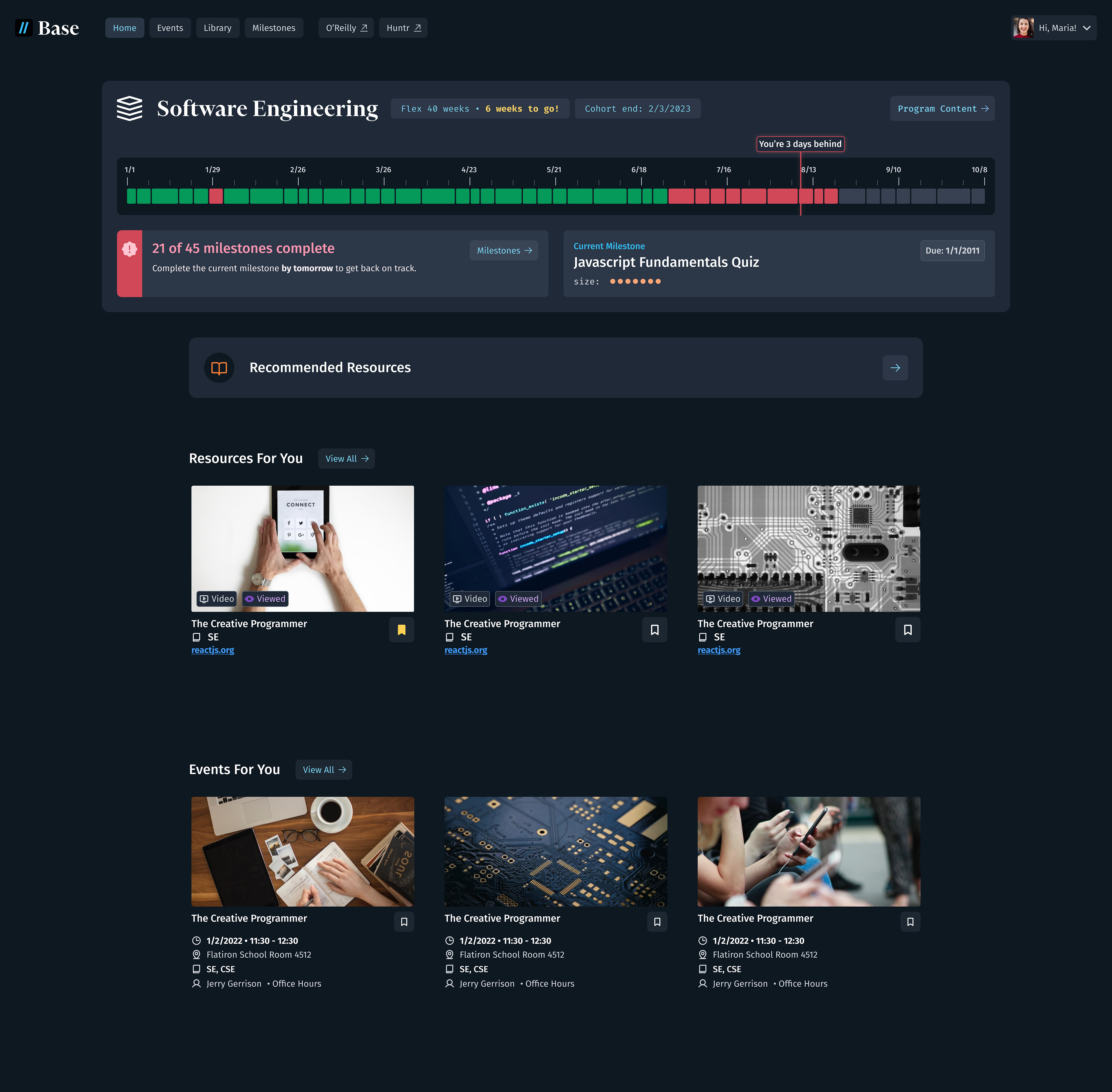
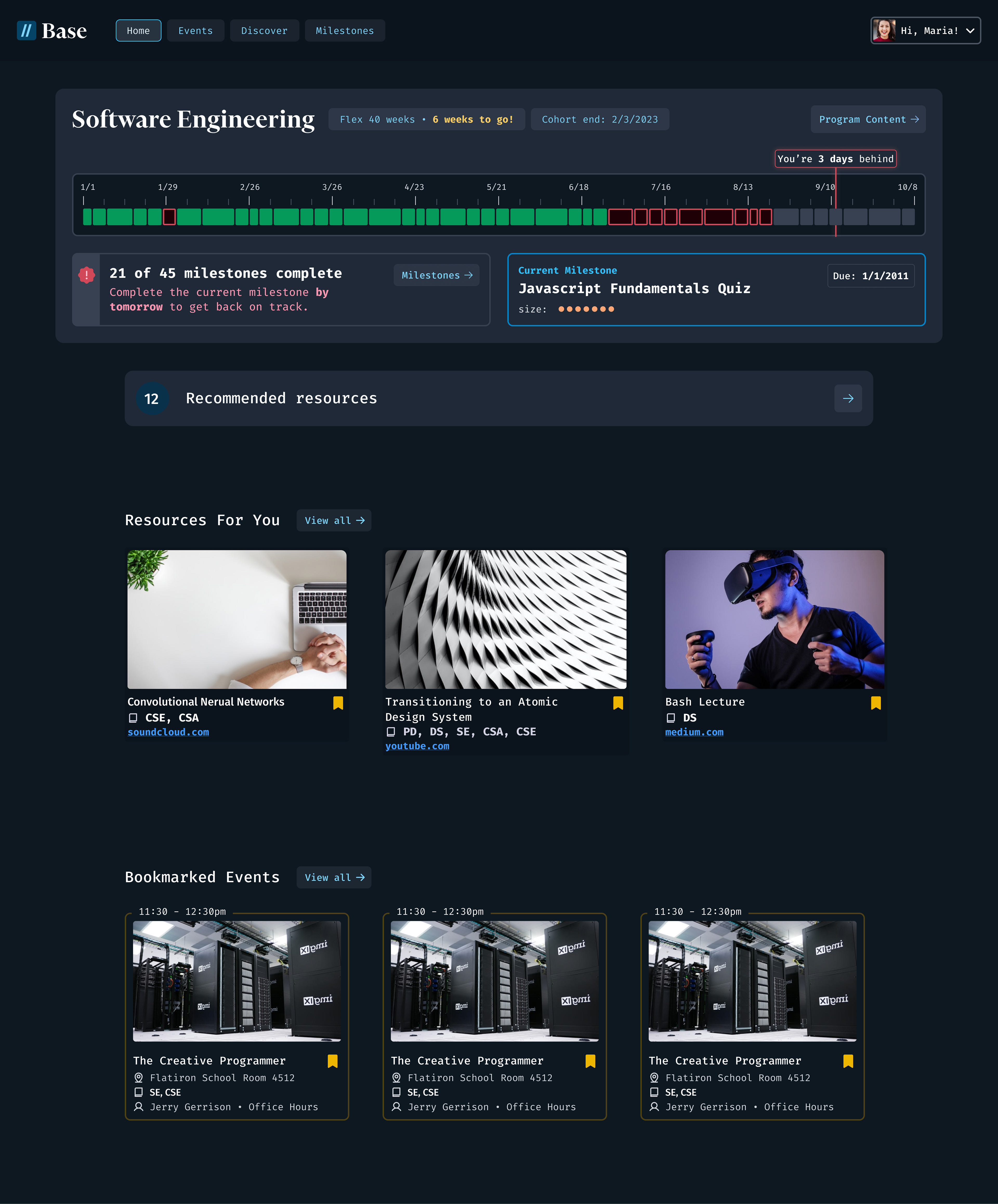
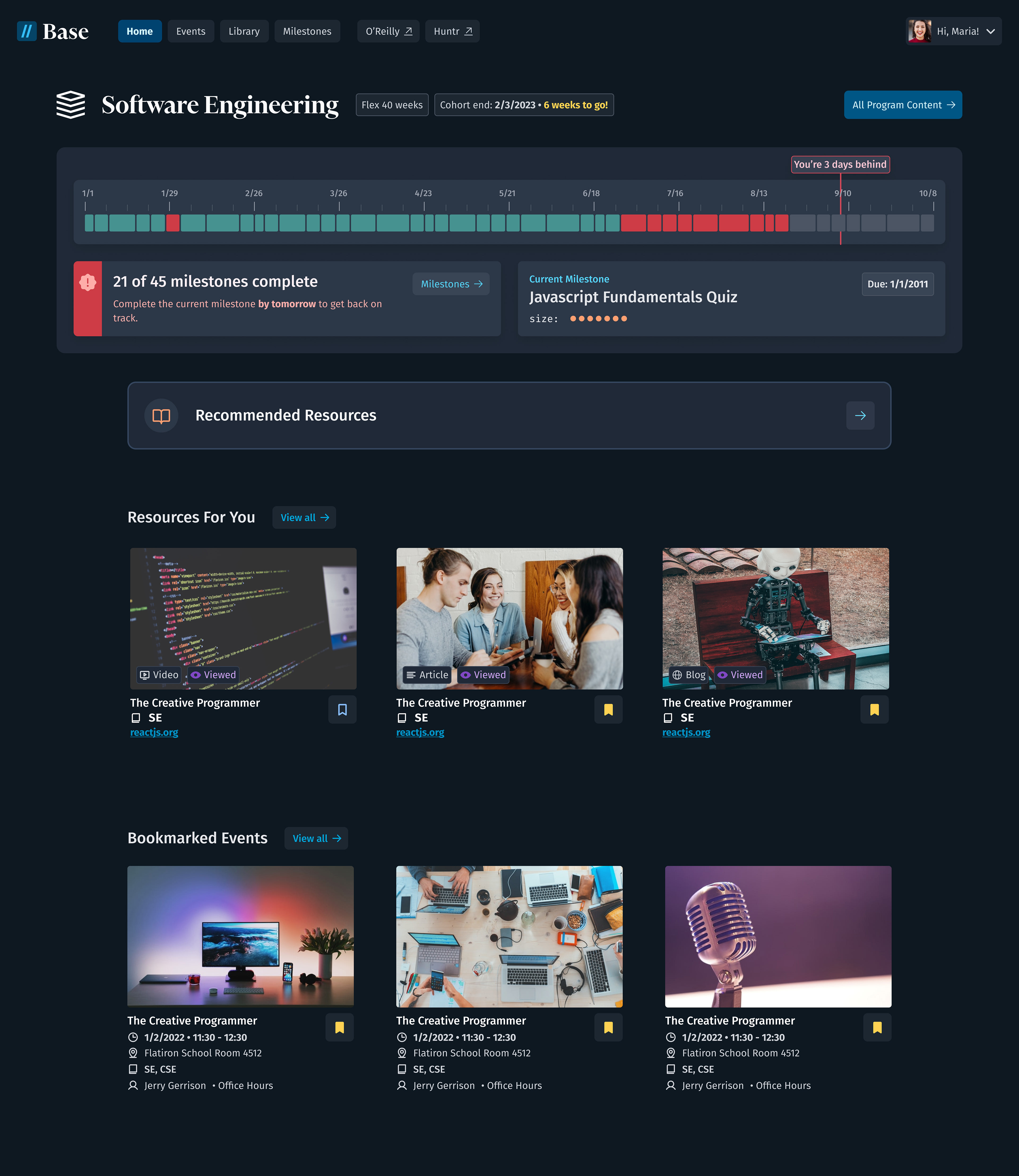
Dark Mode - v1
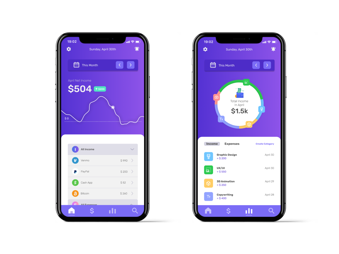
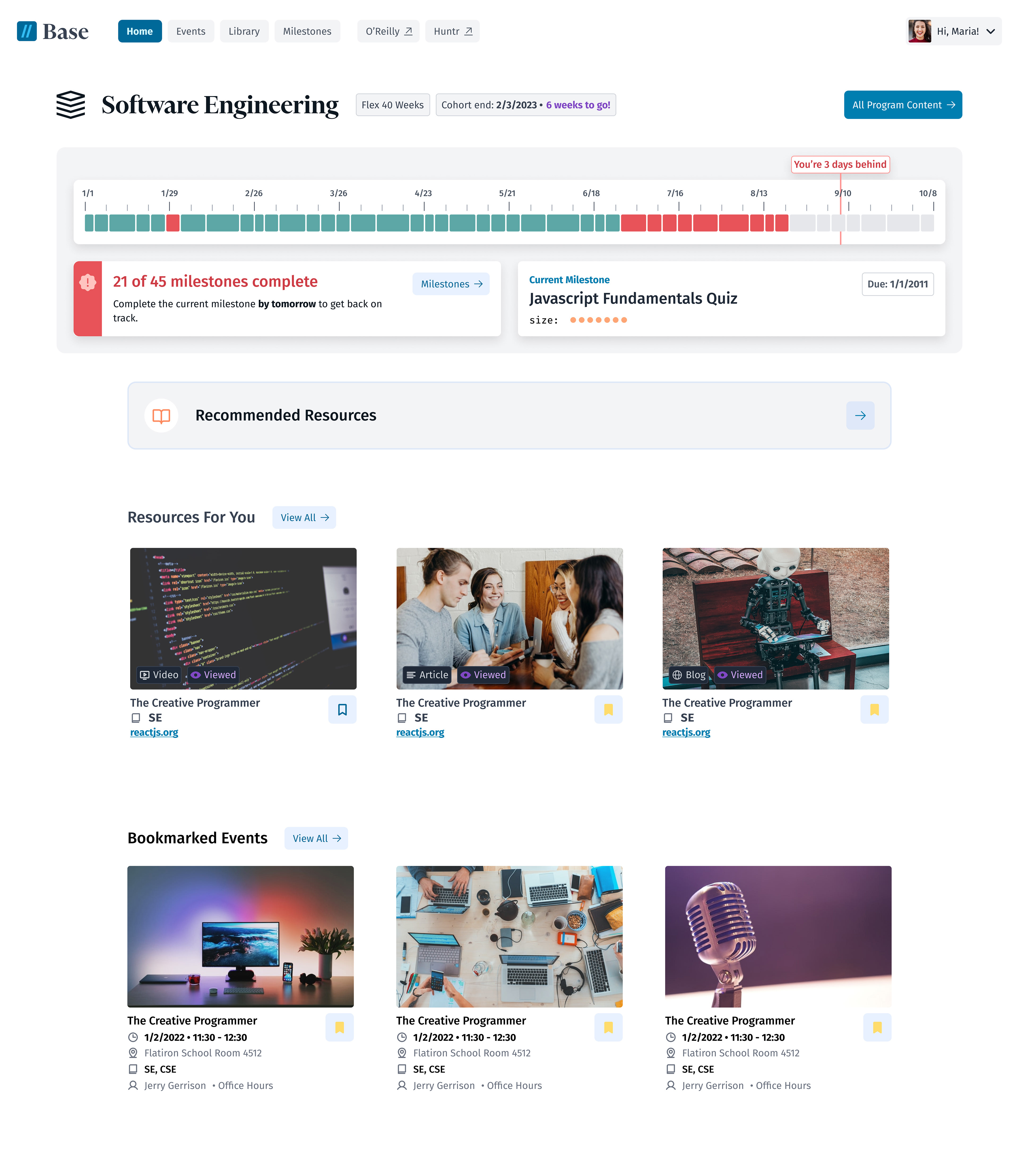
Light Mode - v1
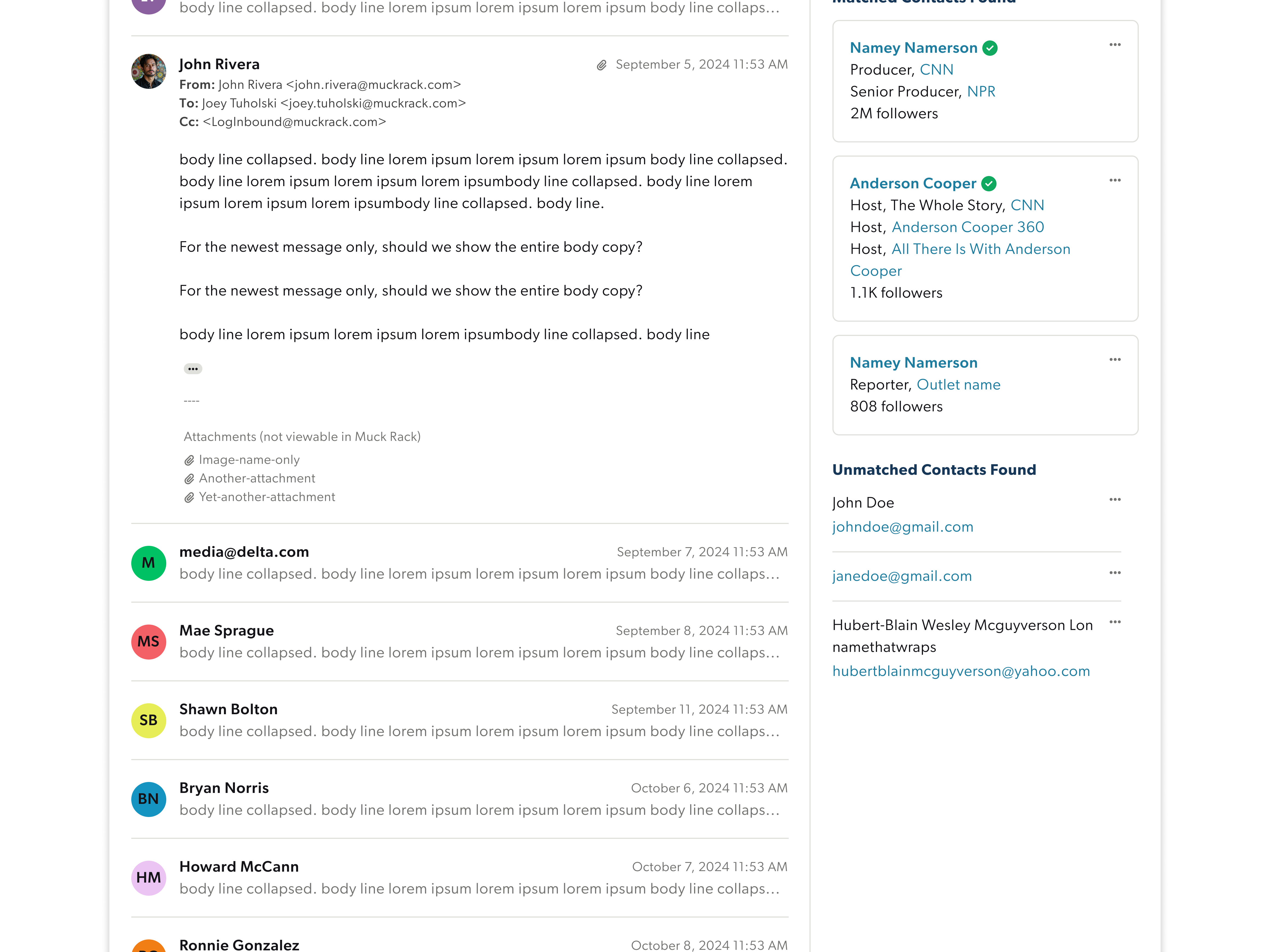
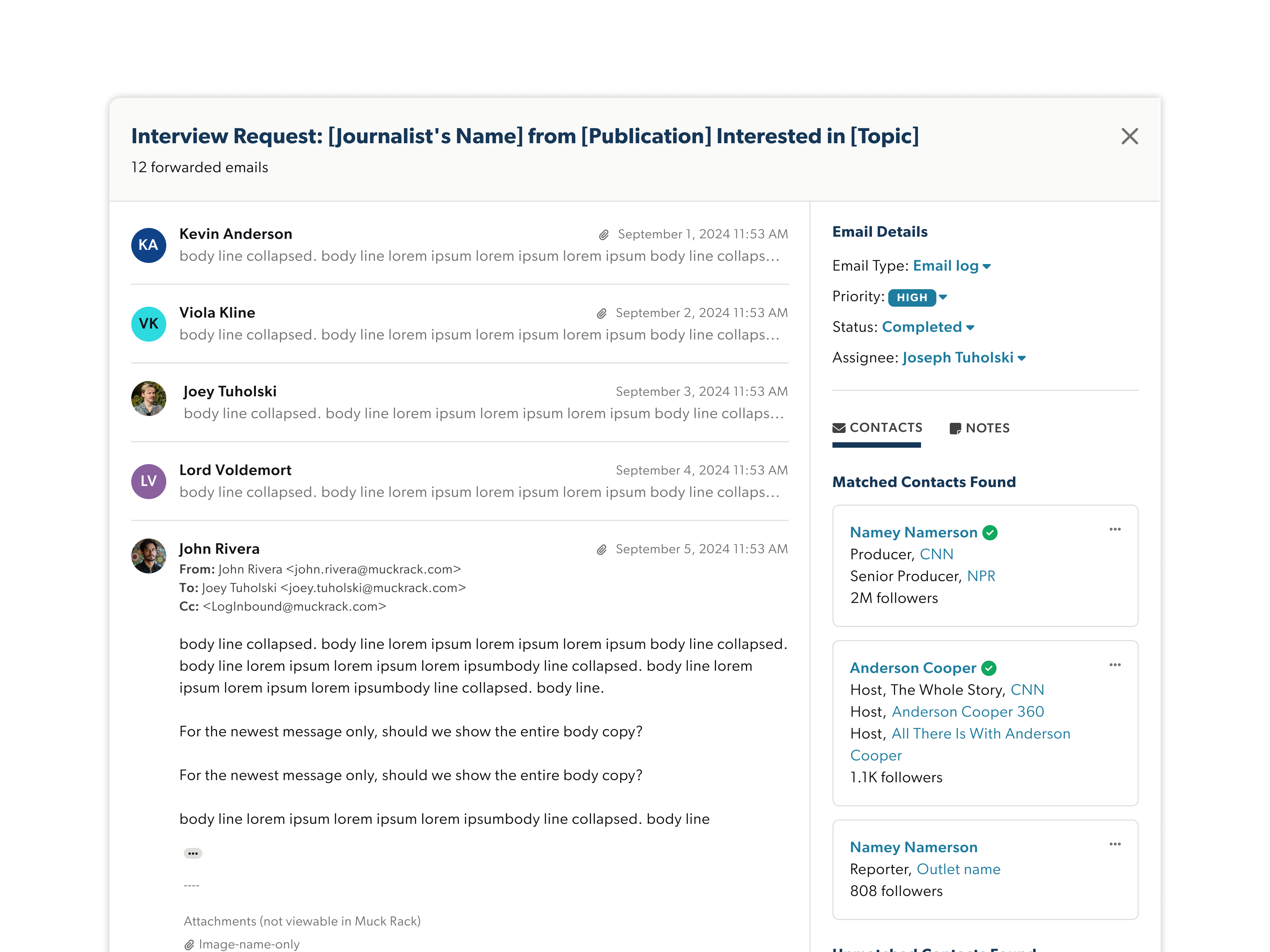
Here's the scenario: After months of iterating and testing, we were happy with the contrast and content in Dark Mode v1. I worked on a team with 2 other designers, including our design Director.
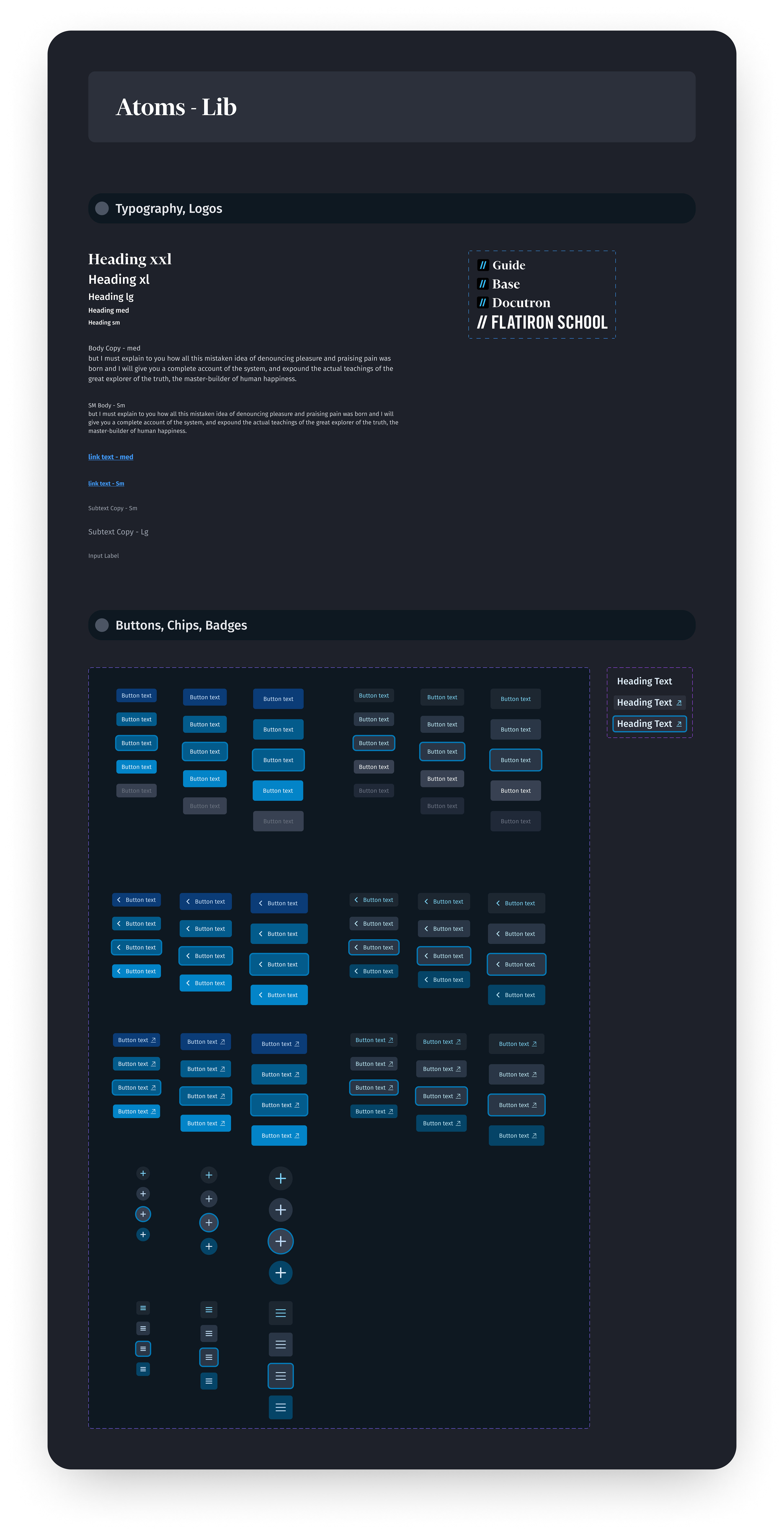
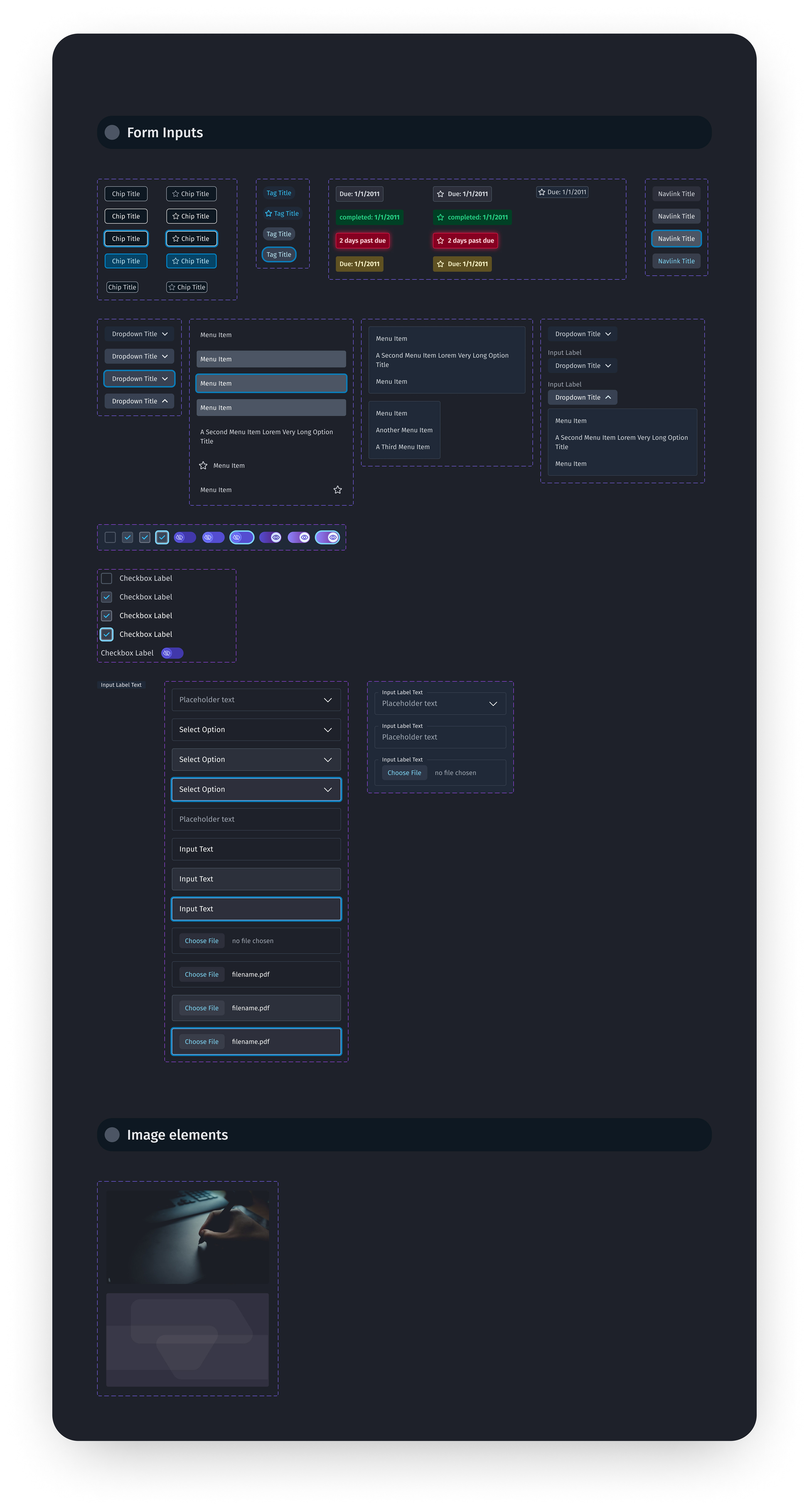
When I joined, we already had an atomic design system for our product, "Base", in dark mode only. This is what students use while they progress through a course.
When I joined, we already had an atomic design system for our product, "Base", in dark mode only. This is what students use while they progress through a course.
The goal was to create a light mode version of our product "Base". I started tweaking color values to the design system first.
However, I soon realized it isn't wise to start on the atomic level and change color values - instead, it makes more sense to modify an entire screen 1 by 1 into an appropriate light mode version.
However, I soon realized it isn't wise to start on the atomic level and change color values - instead, it makes more sense to modify an entire screen 1 by 1 into an appropriate light mode version.
See, when you change values on the atomic level first, you are shooting blind. Change on the screen level and continue to experiment. Once you've tested and landed on the final design decisions, you can change the atomic design system last.
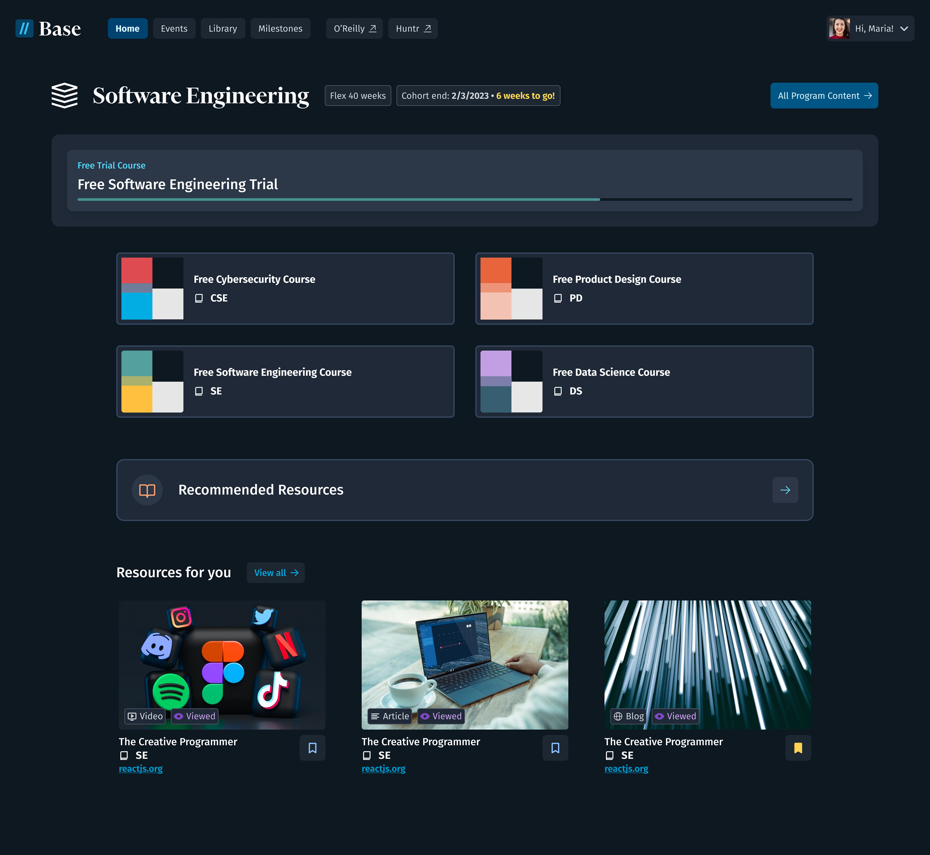
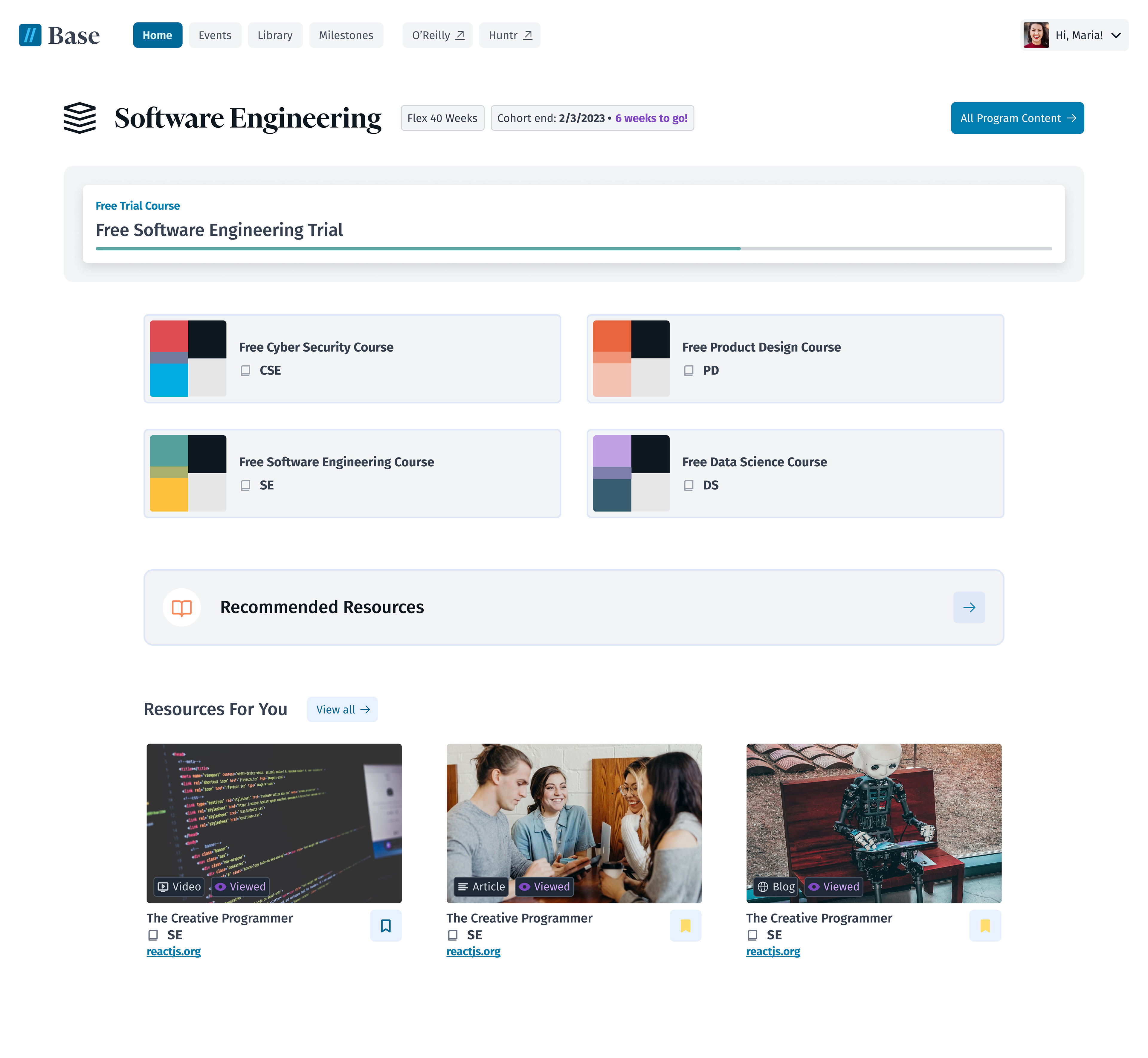
The improved FIS design system:
Ultimately the toggle from dark mode to light mode should be seamless for the student. This means manually tweaking color values to match the desired message, aesthetic, and utility of each element or color value on the page.
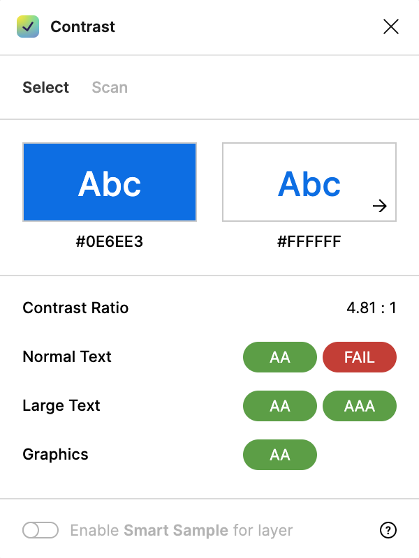
And of course, you have to account for contrast. I used a contrast checker plugin to make sure every color choice follows WCAG accessibility standards. We collectively decided as a design team to strive for AAA passing on normal text, but it's also okay to break that rule sometimes.
Tweaking color values to follow WCAG standards while still conveying the appropriate message was by far the most time-consuming part of this project.
Tweaking color values to follow WCAG standards while still conveying the appropriate message was by far the most time-consuming part of this project.
There was still a problem though. We recognized a missed opportunity. These colors have electricity and look great, but there was a mismatch between the branding of our marketing site and our product, "Base".
We could do a better job to tie in the colors from our marketing website into our product.
As a design team, we realized it's our job to have cohesive branding throughout the entire student experience. And with the v1 screens, there were totally different shades of red, green, etc.
There are 2 graphic designers on the team who worked hard to rebrand Flatiron School's visual identity, as well as the four courses we offer.
With the v2 versions, I decided to try to tweak the color values to match what our graphic designers had come up with.
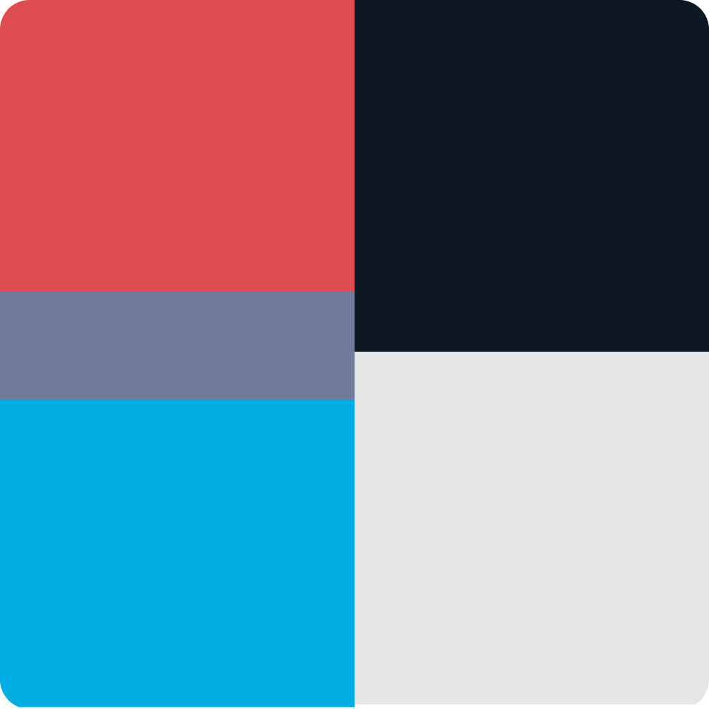
Cyber Security

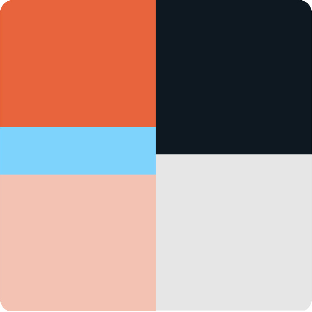
Software Engineering
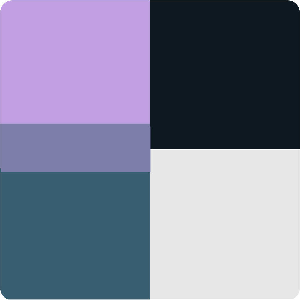
Product Design
Data Science
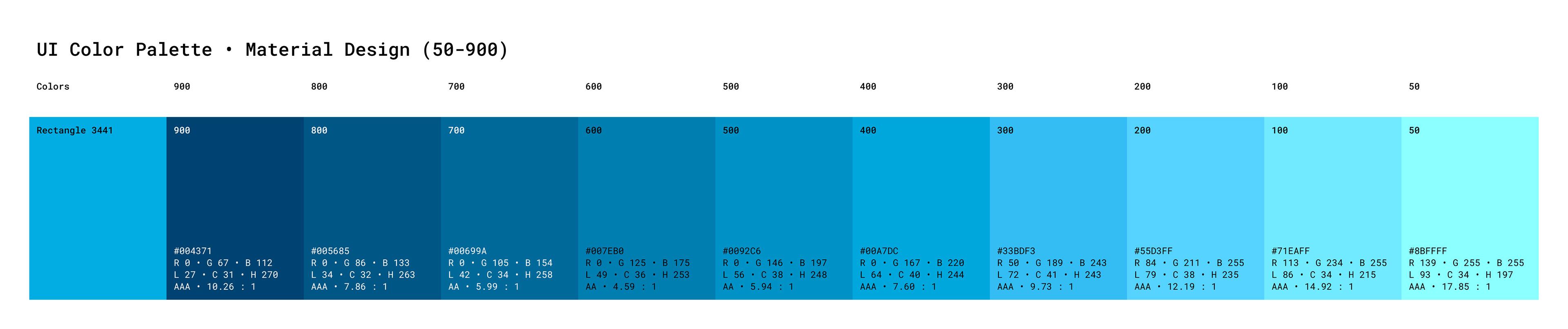
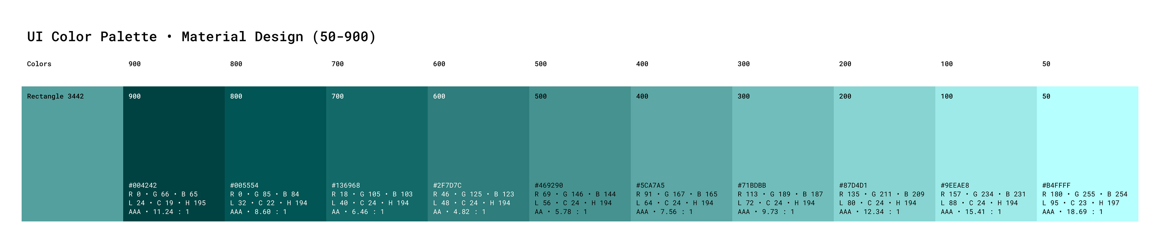
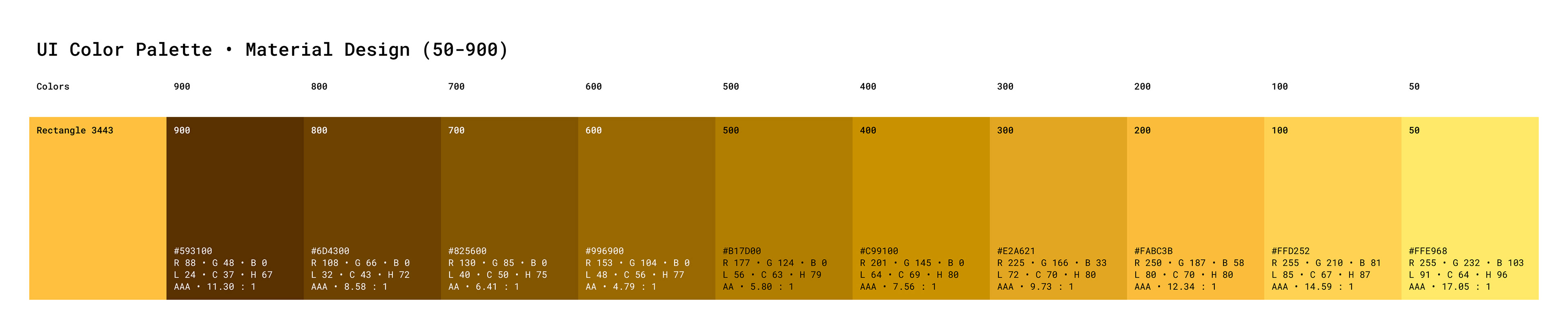
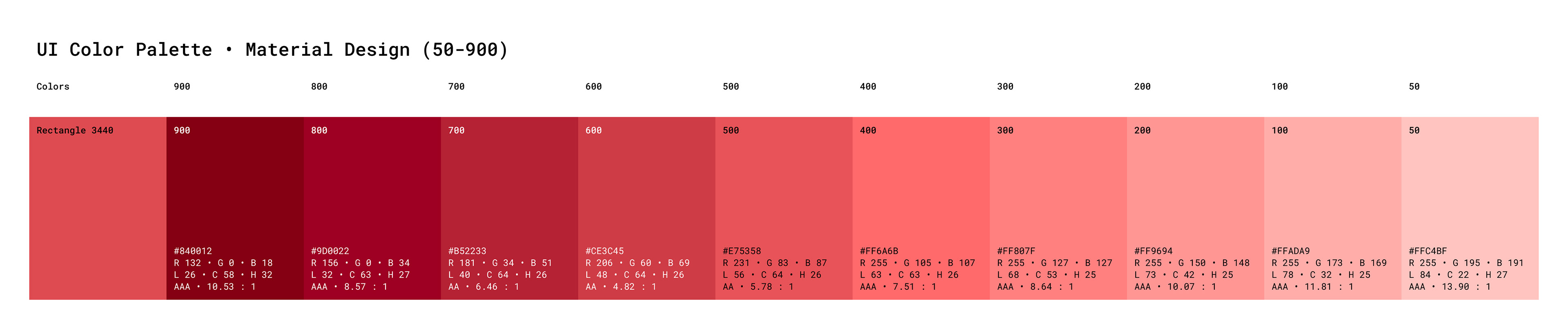
Using these new colors, I created new color palettes and added them to the styles library.
To do this, I used the Material Designs standard of color values 50-900.
Dark Mode - (old)
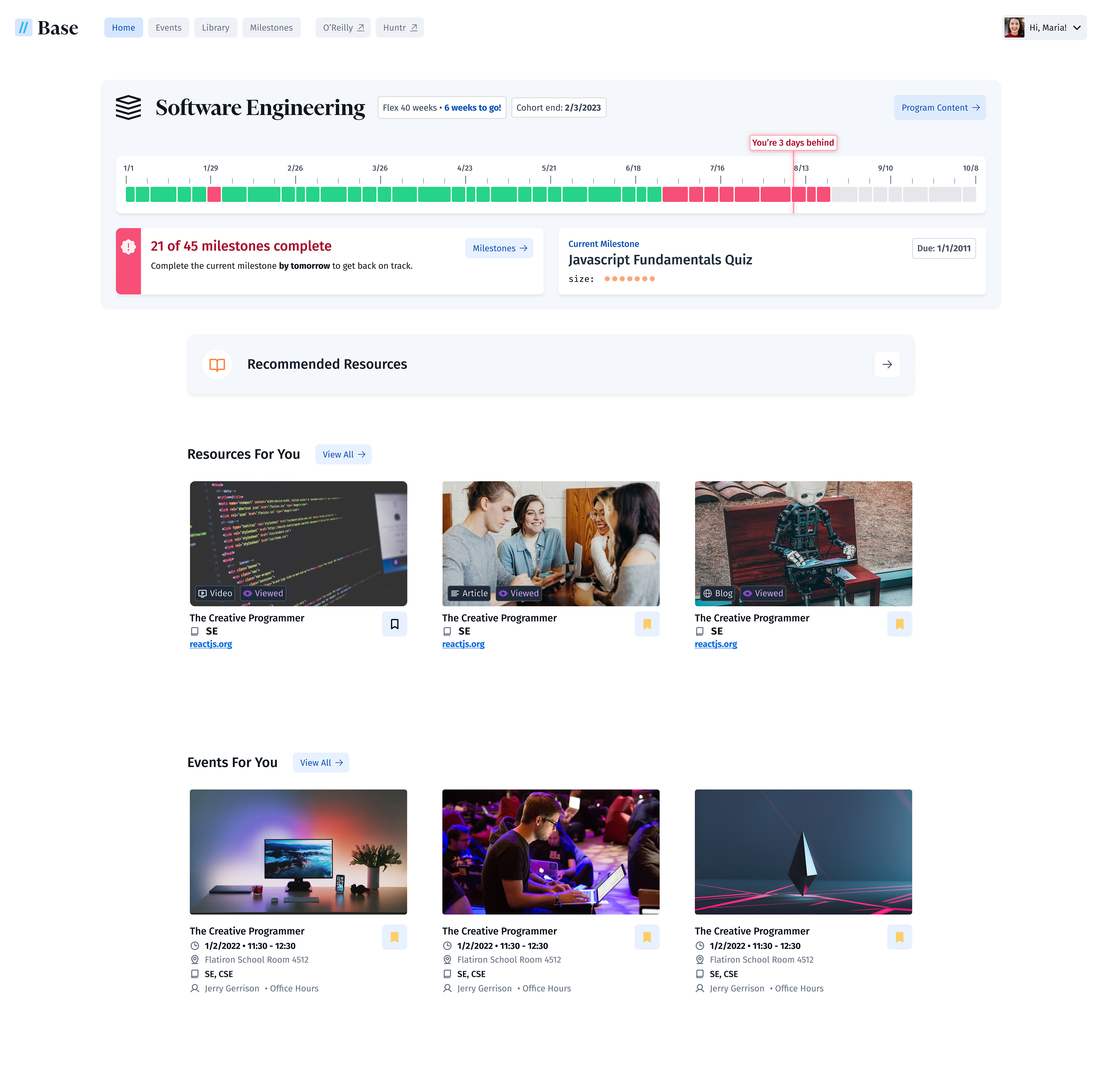
Dark Mode - v2 (final)
Light Mode - v2 (final)
Some changes in the v2 screens include:
• Using primary and secondary buttons instead of just secondary buttons
• Changing all text from "Fira Code" to "Fira Sans"
• Moving the course title row outside the large container
• Giving all badges a background and stroke
• Adding a subtle stroke around containers, to aid in contrast and usability
Everything was made with care in auto-layout. This makes it much easier to hand off to developers and tweak designs.
As mentioned in the header, I am responsible for lots of other design, research, testing, and prototyping work at Flatiron School. We are a small team and that comes with a lot of autonomy.
This is just one major project that showcases the heavy UI work I'm capable of doing within Figma.
Reach out to me and I’m happy to walk you through all of my work at FIS! We work in 6-week product cycles following the “Shape Up” methodology.
Reach out to me and I’m happy to walk you through all of my work at FIS! We work in 6-week product cycles following the “Shape Up” methodology.
I paired with a dedicated product manager and developer in each cycle.
I was fortunate to work alongside our design director, Matt, on a regular basis.
I was fortunate to work alongside our design director, Matt, on a regular basis.
Thanks for reading.