My Role
• Design Intern on a team of 3 total designers
Constraints
• Quick turnaround, so dev could code
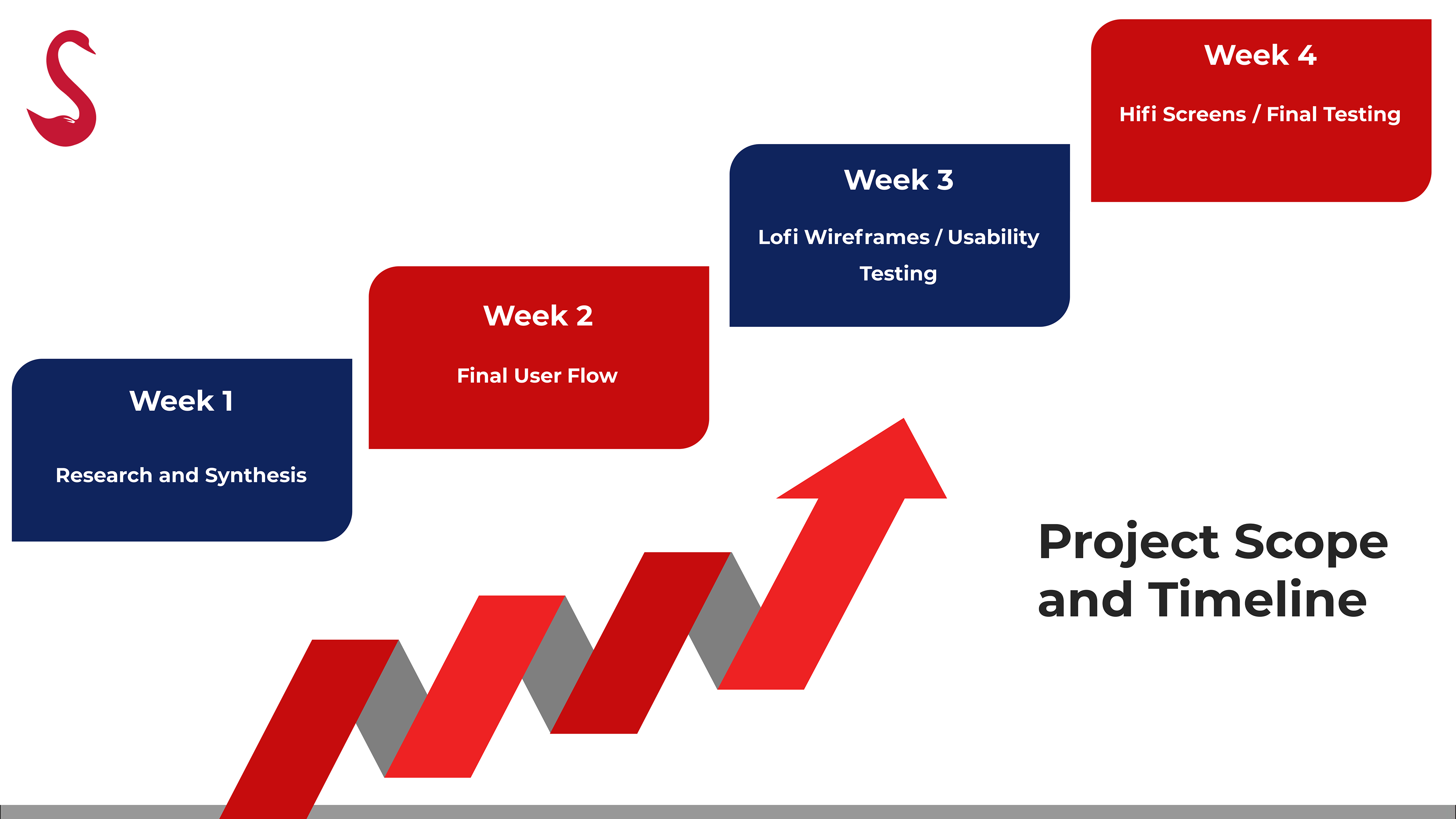
Timeline
• One month to work with this client
THE PROBLEM
This is a popular dating app for expats and we were tasked with developing a "friendship mode".
We worked with a client based in Sydney, where the dating app is popular. Our UX copy had to keep this culture in mind.
THE SOLUTION
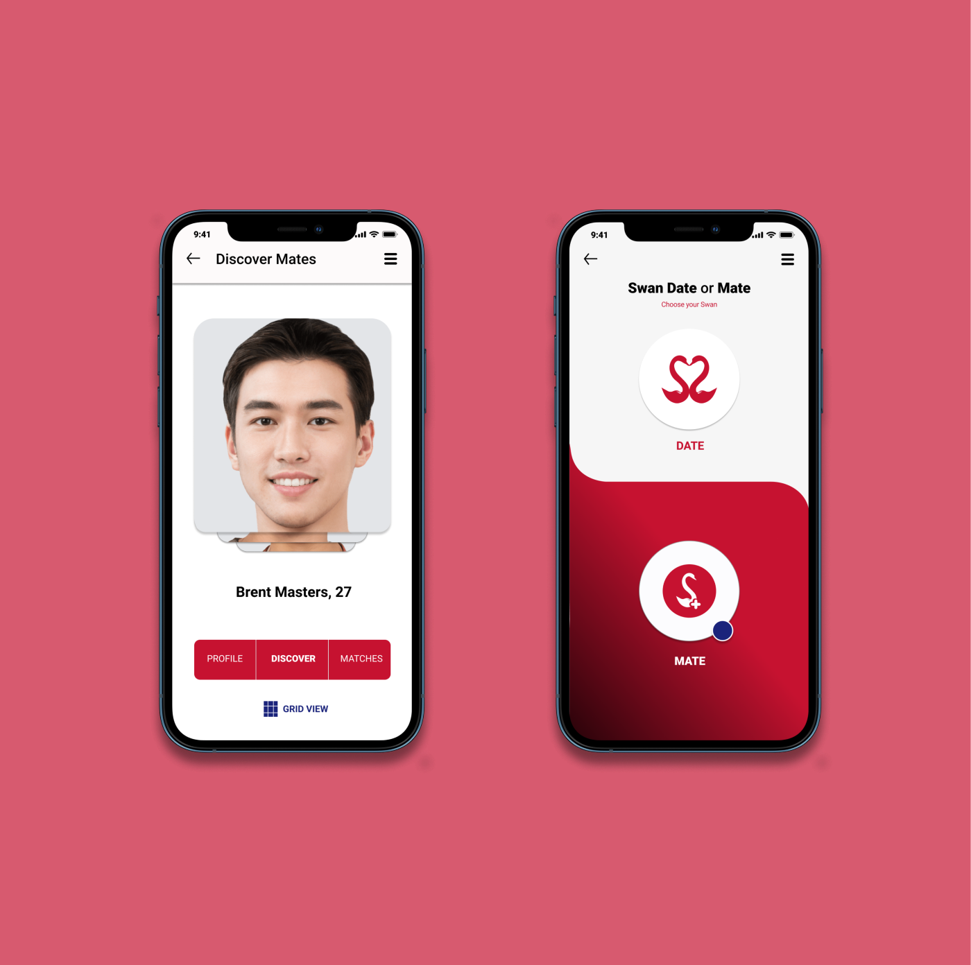
Create a complete friendship mode flow for users on this dating app. We called it “Mates Mode”.
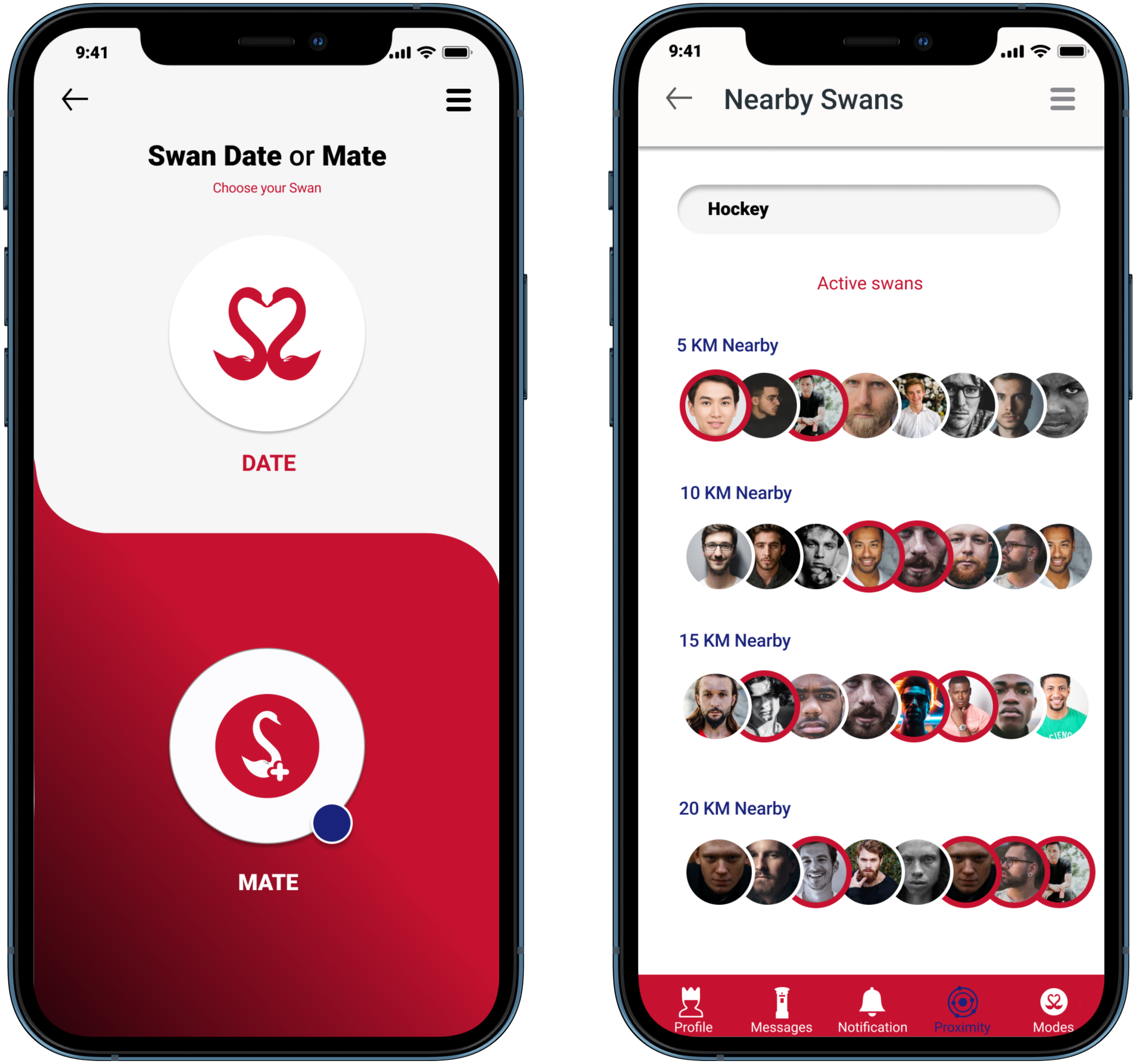
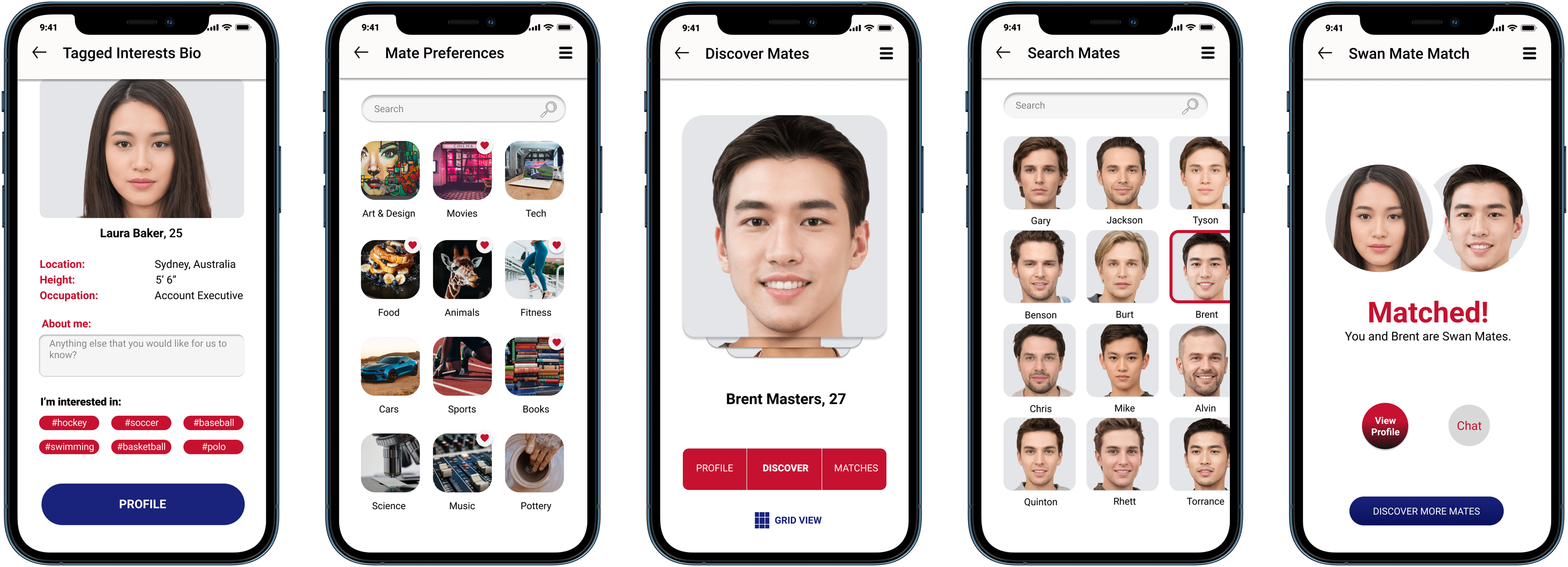
• Select a mode, "Date" or "Mate"
• Search for mates by proximity
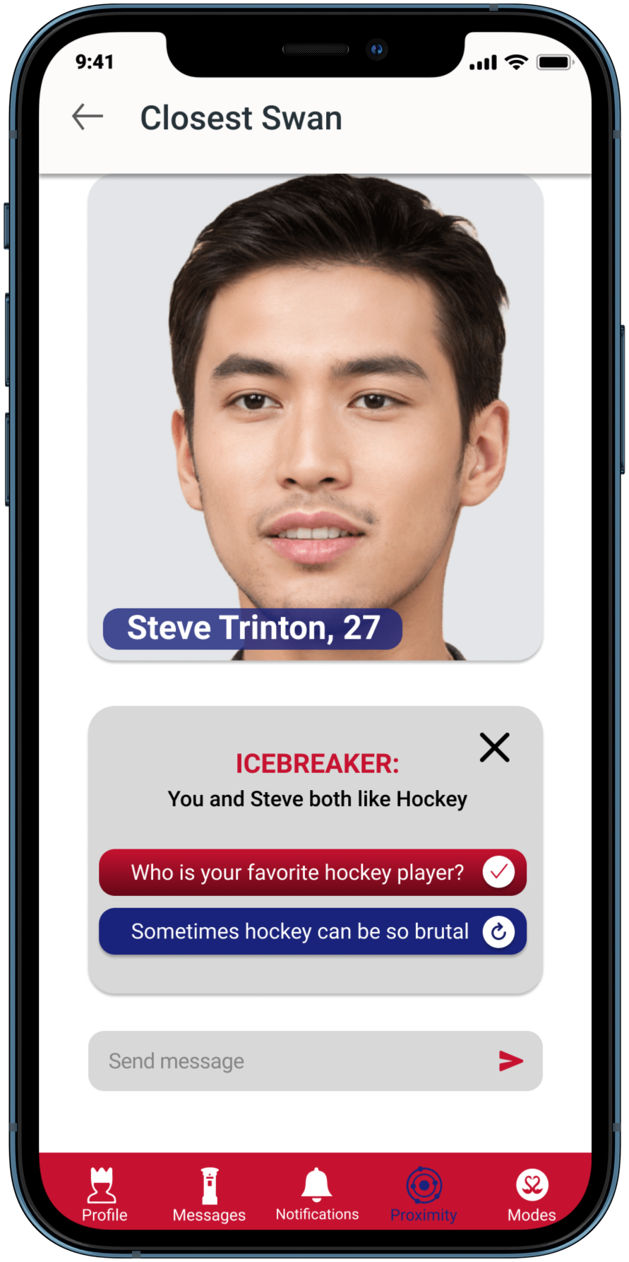
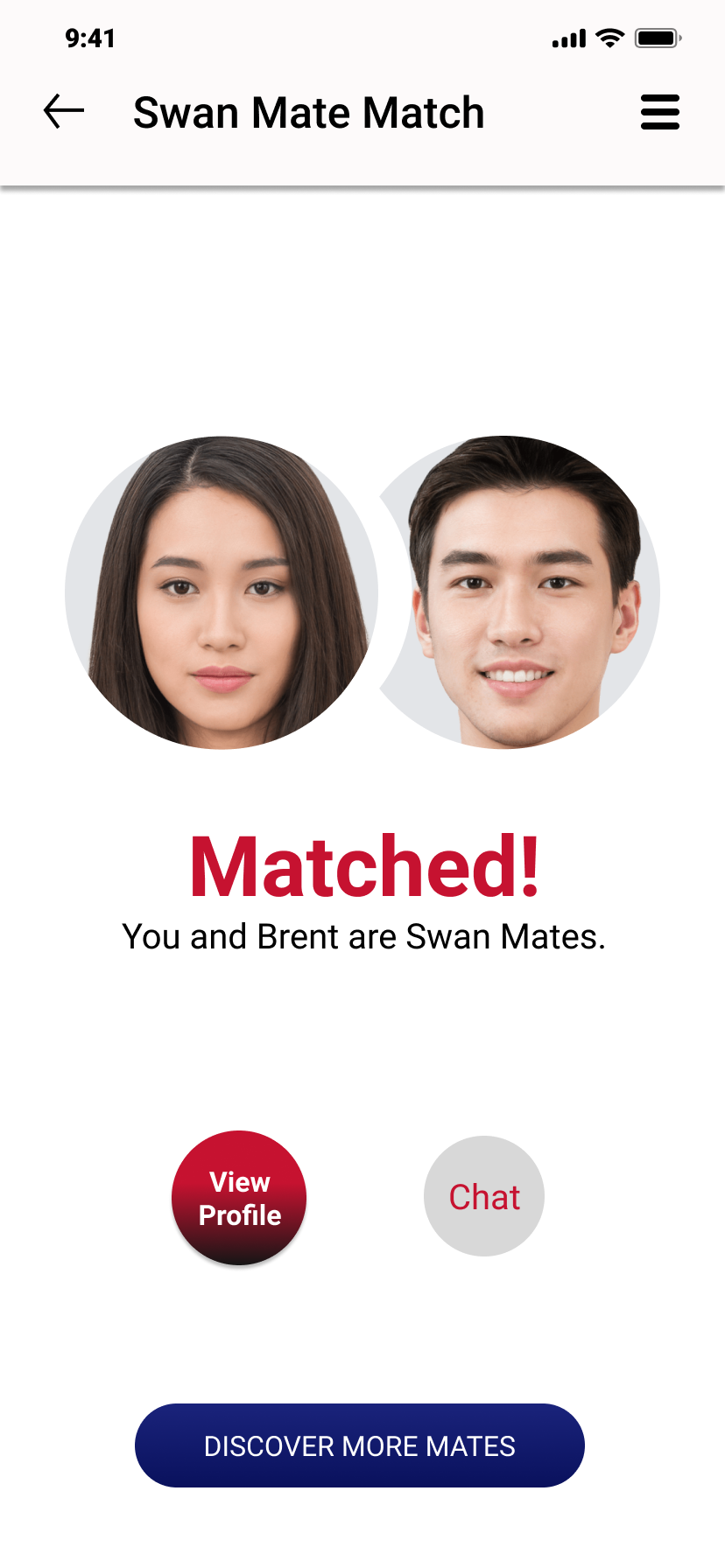
• Be shown potential mates to start a conversation
• To make the introduction easy, start with an icebreaker
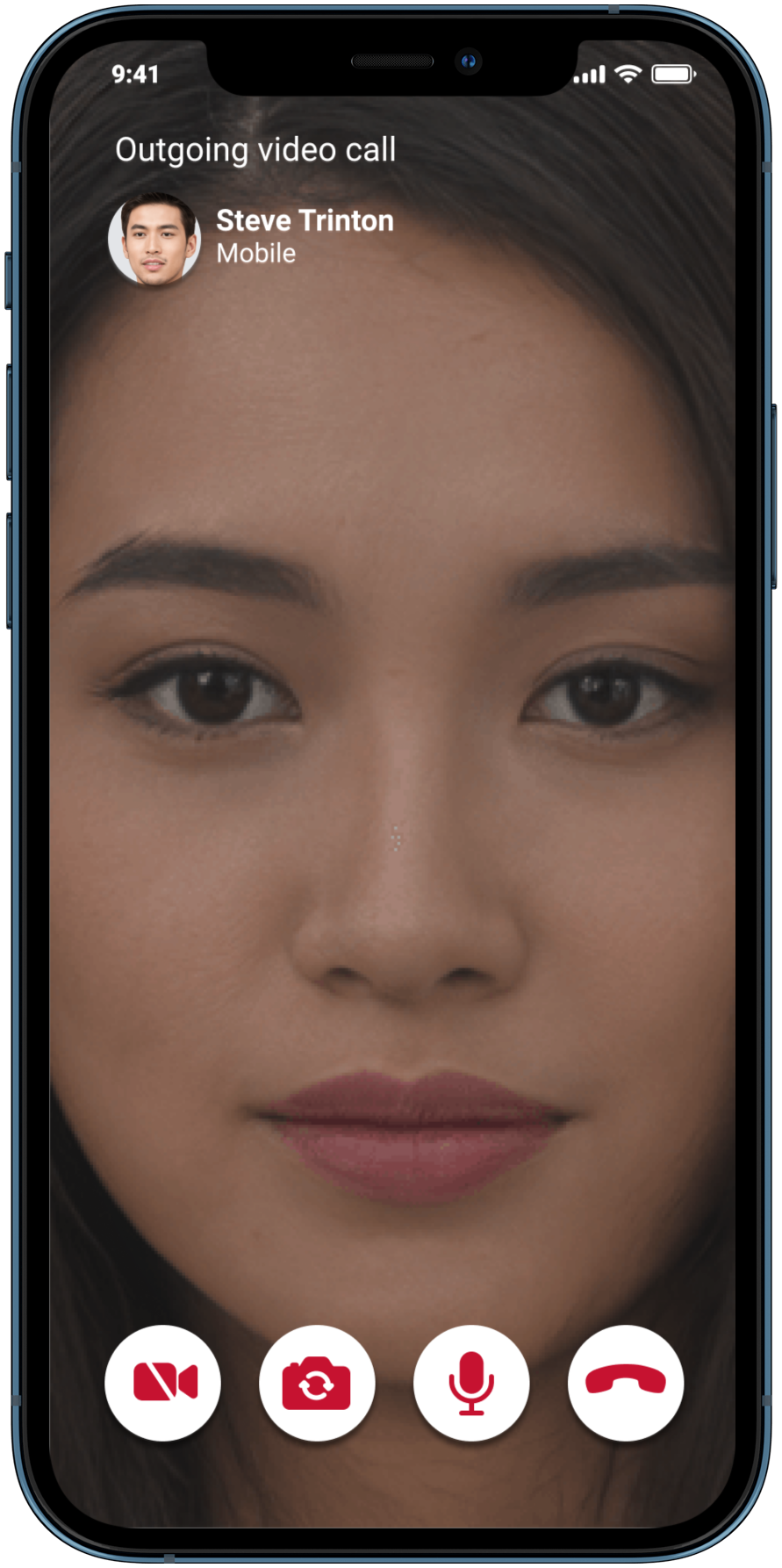
• After matching, users can video chat within the app
• Some may prefer video to meeting up in person
• This allows for safe interaction during the pandemic
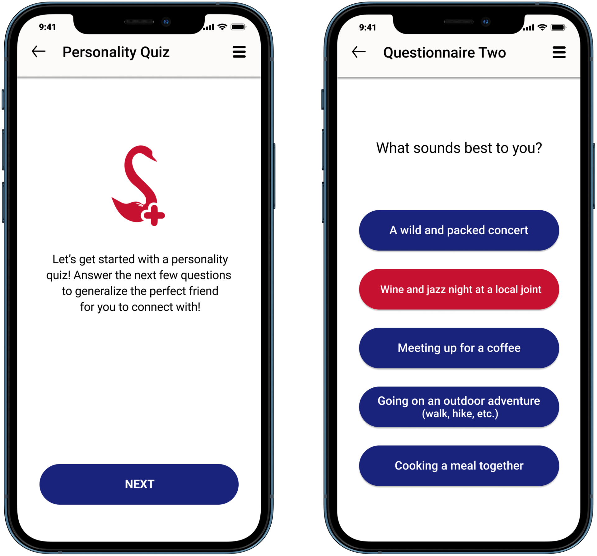
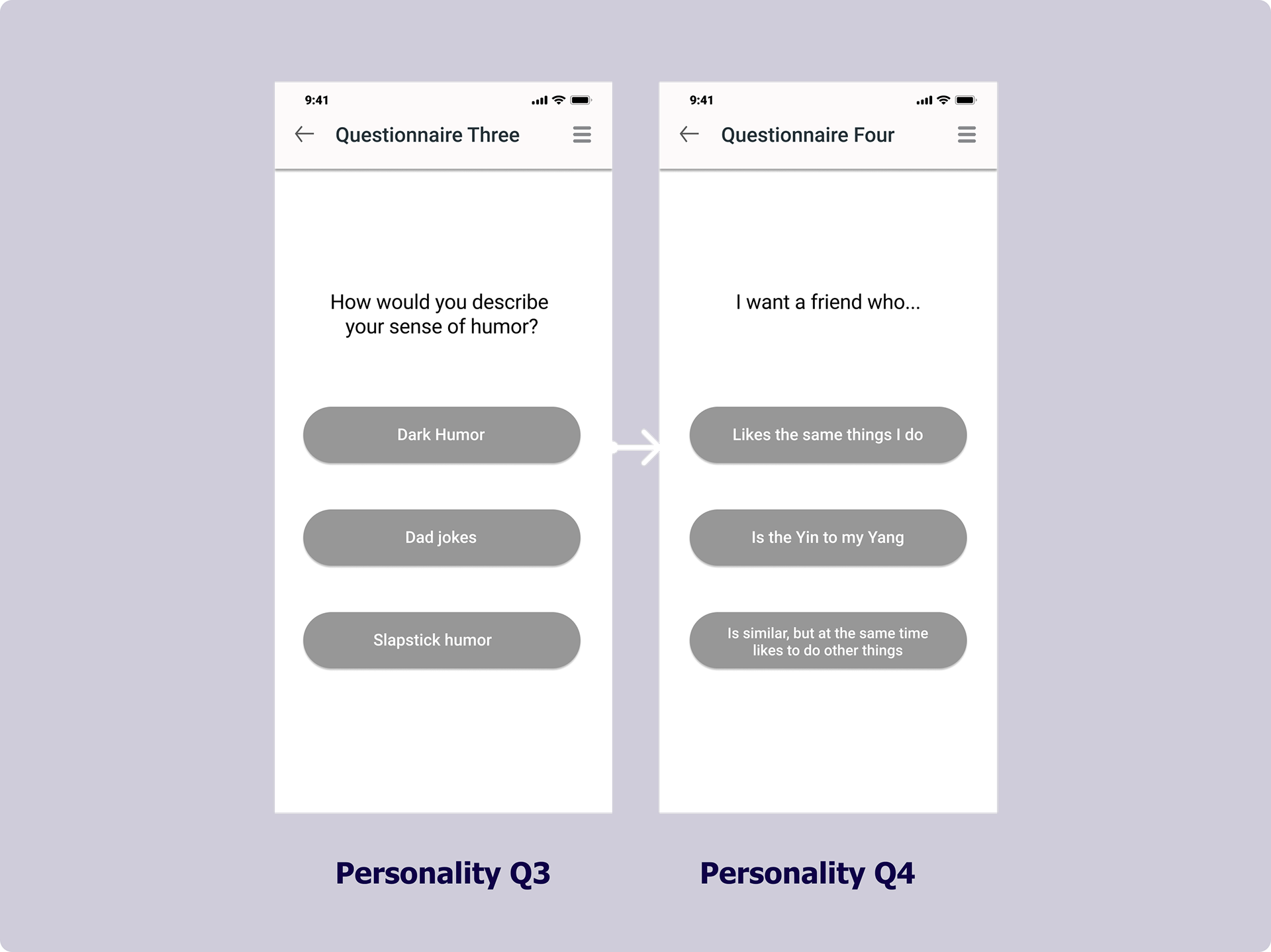
• Short personality quiz
• Matches based on algorithm
• Only a few screens, so Swans can start using the app
COMPETITIVE ANALYSIS & THE GAPS
Okay, so which apps already do this?
What other dating apps also let you find new friends? Not many.
We checked out all of the flows of each of the apps below and mapped each step in Figma.
Then did a collective brain dump of potential ideas for our app.
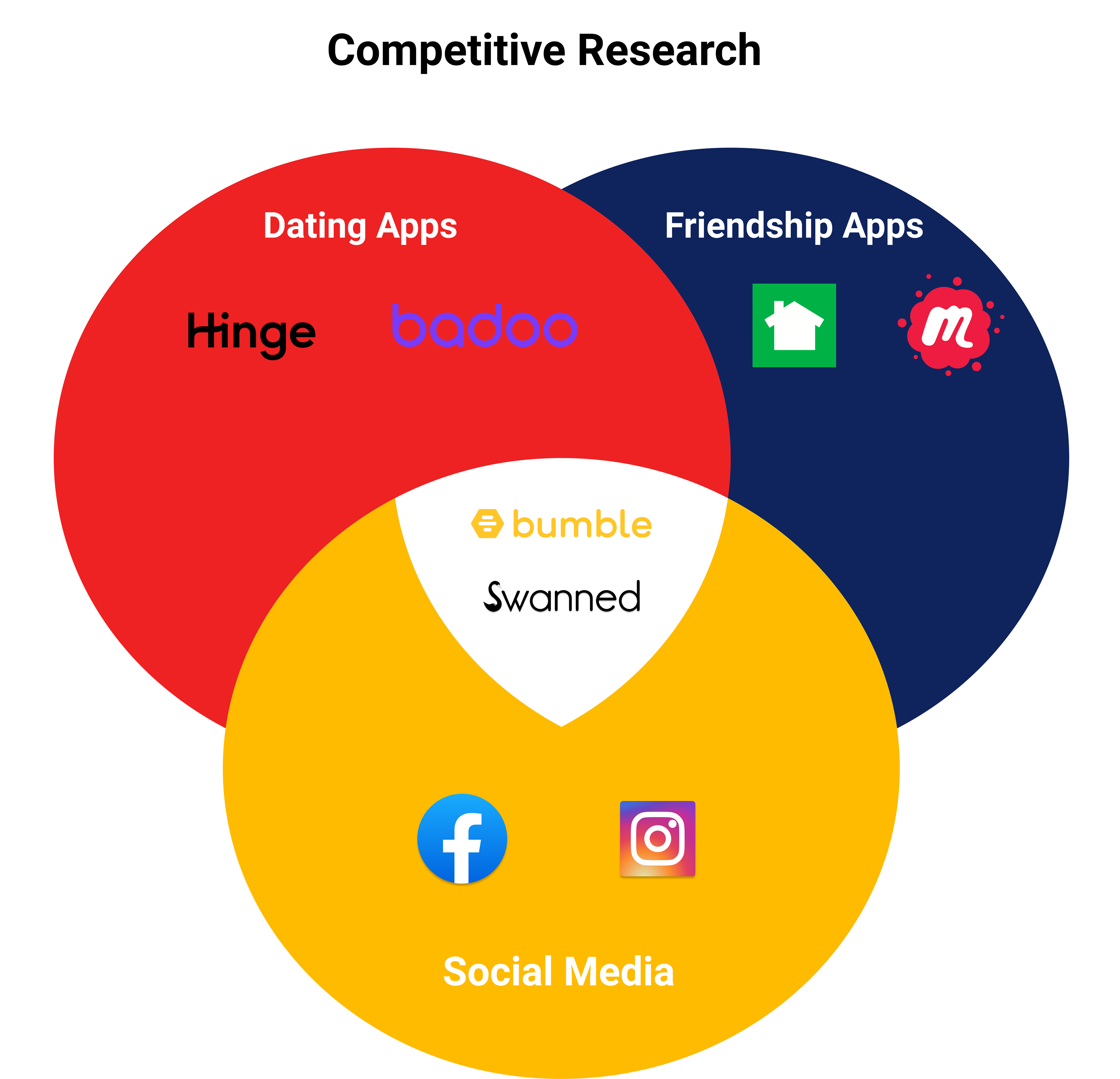
• Bumble is the only other app we found that incorporates a friend mode into a dating app.
• One of our research questions was “How can we differentiate this app from Bumble?”
• The rest of our research was all secondary.
Bumble and Swanned are in the middle, so what's the difference?
Swanned is niche, it’s mainly for expats. When it comes to some core features of this app, Bumble doesn’t have a proximity mode feature, nor does it have a personality quiz.
INITIAL BRAINSTORMING
So how should we effectively make a friendship mode within a dating app?
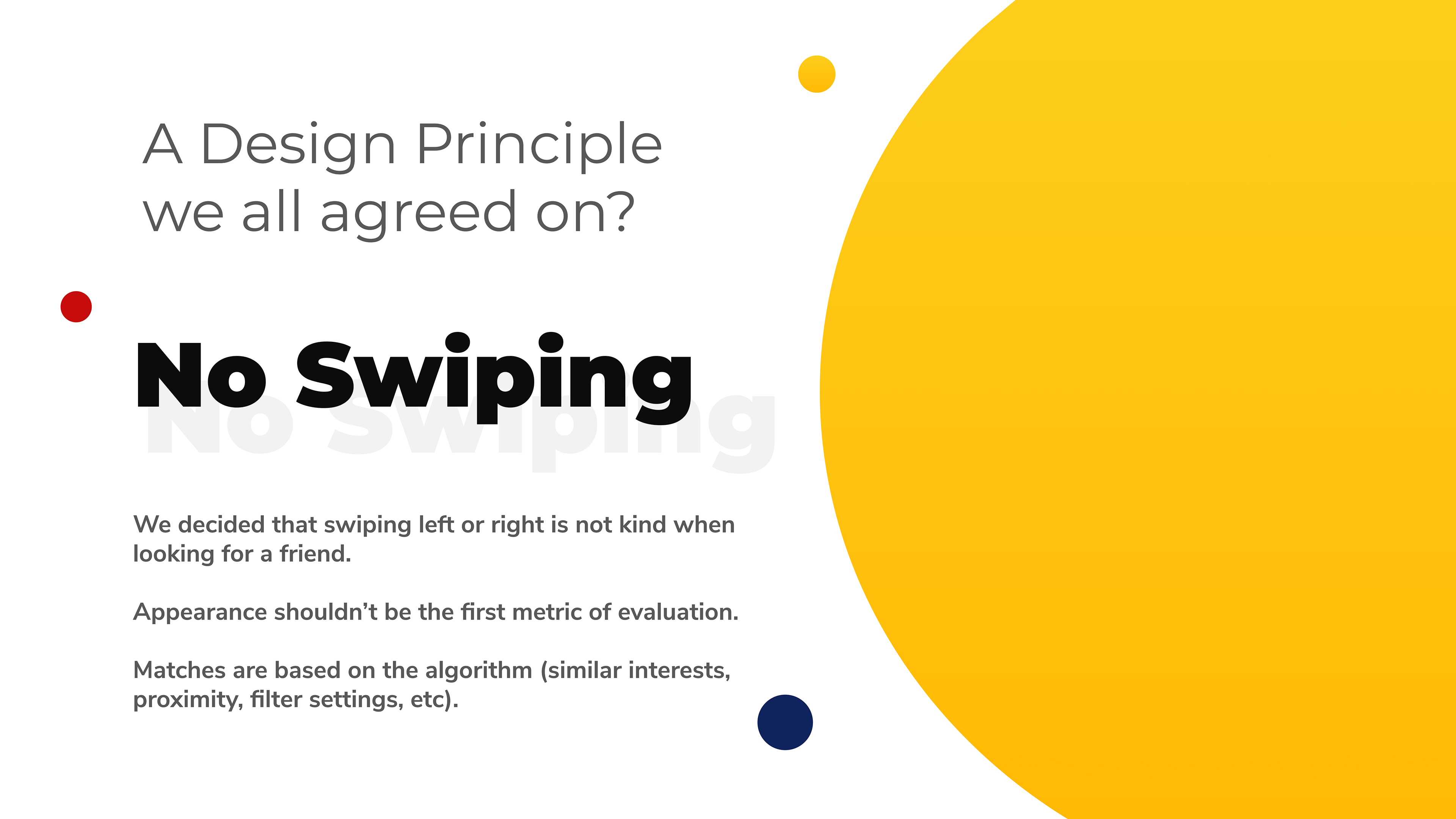
How do we go about integrating a friendship mode that makes sense to users already swiping left and right on a dating app?
The challenge was to make 2 apps in 1.
LOFI WIREFRAMING
We had a general idea of how the UI should look since Swanned already has a design system.
The client handed us a Sketch file with some of the original screen designs for Swanned. I took exported the designs as SVG's, imported into Figma, and began the lofi wireframes.
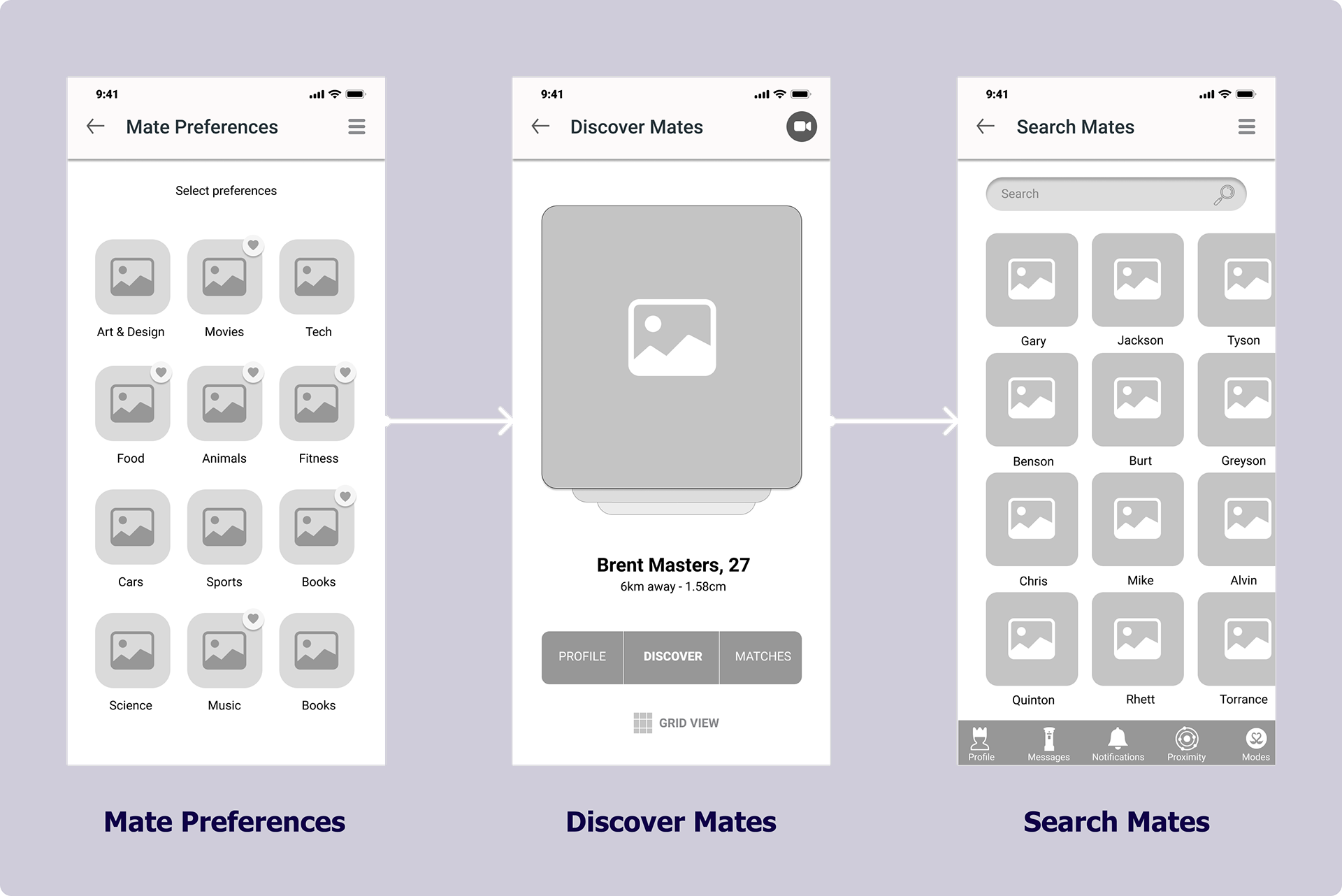
• Select some interests
• Paired with mates who match those interests
• Use "Grid View" to see a list of all current mates
COLLABORATIVE DESIGN DECISIONS
Feedback from the client & developer lead to two major design decisions.
1) Proximity Mode
2) Personality Quiz
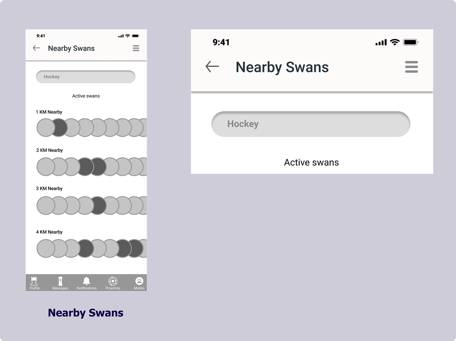

• Our client mentioned "finding friends by proximity" is definitely a must
• Users can search nearby "swans" based on mutual interests, such as "hockey"
We tested the personality quiz on five users and received positive feedback.


USABILITY TESTING
We ran 2 rounds of testing on 5 users.
1 round of guerilla usability tests was conducted on the lofi wireframes and prototype, followed by a round of usability tests on the hifi prototype before we landed on the final screens.
Each participant clicked through the screens as we asked them to think out loud.
IMPROVEMENTS AFTER TESTING
2 major improvements in the design.
The results from those tests lead to these 2 major changes. We increased the distance radius to solve for a possible edge case in the future.
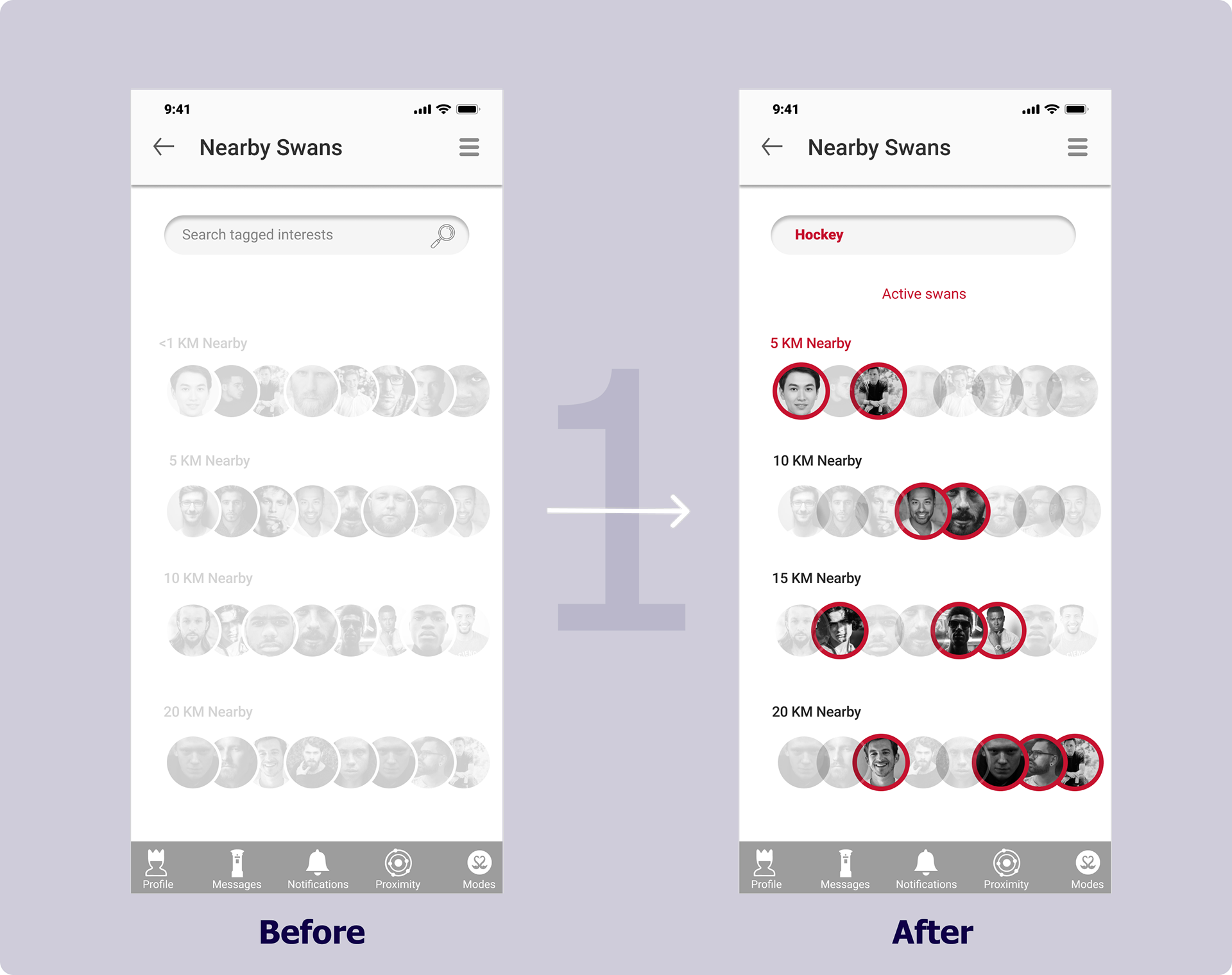
• Edge case - "<1 KM" is too small of a radius to keep users safe. We modified it to 5 KM
• Added a tagged interest "hockey" to communicate the feature more clearly
• Strokes around the avatars better illustrate users with the same tagged interest
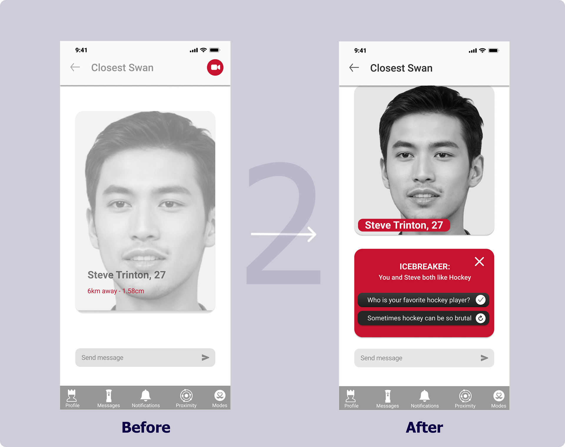
• The addition of the icebreaker feature to make it even easier to start a conversation
• Should not be able to video chat with a mate before having a text interaction
• Scrapped the proximity information on this screen

FINAL SCREENS
Below are a few of the final high-fidelity screens.
View the prototype in Figma.
Thanks for reading :)
Please take a look at my other projects below!